AVIT is an investment product for the Costa Rican stock market. When I joined, its design lived entirely in Figma: beautiful screens, one per state, and a team that took weeks to find out whether an idea worked. There wasn’t a single prototype anyone could touch. This is what I built to change that — and it’s still under construction.
The product hasn't launched and the work is ongoing, so this is a slice, not a finished case. I'm showing the method, the design system, and the pieces I'm free to show. Left out: the link to the lab, the client's own screens, and every business figure — the percentages you see in the screenshots are masked on purpose. I'll keep adding chapters as the project moves.
the context
My role is Product Designer wearing two hats at once: the design system and the prototyping. AVIT is mobile first, built for Costa Rica, and a good share of its flows are non-negotiable because regulation requires them — which leaves every design decision with little room and a lot of weight.
& prototyping
& ongoing
20 prototypes
where it started
The Figma library was called COMPONENTS and it had drifted without anyone noticing. Four components were published twice over — Button, Button Group, Social Button, Download App Button — and nobody knew which one was canonical. Token names carried baked-in typos: pimario 100 missing its r, terceario instead of terciario, tittle (xl) with a double t. Several grid definitions lied: a grid named “10 columns” had nine. Shadows were tinted with Tailwind’s default palette rather than the brand purple. And spacing and radius tokens simply didn’t exist.
The handoff was the classic one — classic because I’ve lived it everywhere: one static screen per state, and the missing states got asked about later. Measurements were read off the Figma panel. Comments lived locked inside the design file, where only account holders go. The flow was explained with arrows.
None of that is anyone’s fault. It’s what happens when documentation and product live in different tools and only one of them runs.
audit before building
Before drawing anything, I exported the Figma tokens and sat down to read them. Out came 85 colour tokens across ten families, 49 typographic styles split between Montserrat and Open Sans, 14 shadows and 18 grid definitions, plus the 23 components published in the library.
I documented every defect I found instead of quietly fixing it. That was the least obvious decision and the one that paid off most: if the documentation corrects a typo and Figma doesn’t, the documentation starts lying the day it’s written. So pimario 100 stayed written as pimario 100, with a note beside it explaining what happened. Same for the page Figma titles “Iconography” and describes as Ionicons when the layers are, in fact, Boxicons: reality wins over the title.
The tokens Figma didn’t have I invented and flagged as local convention, so they’d stay distinguishable from the exported ones: a five-step spacing scale derived from the grid’s own gutters, and a four-step radius scale.
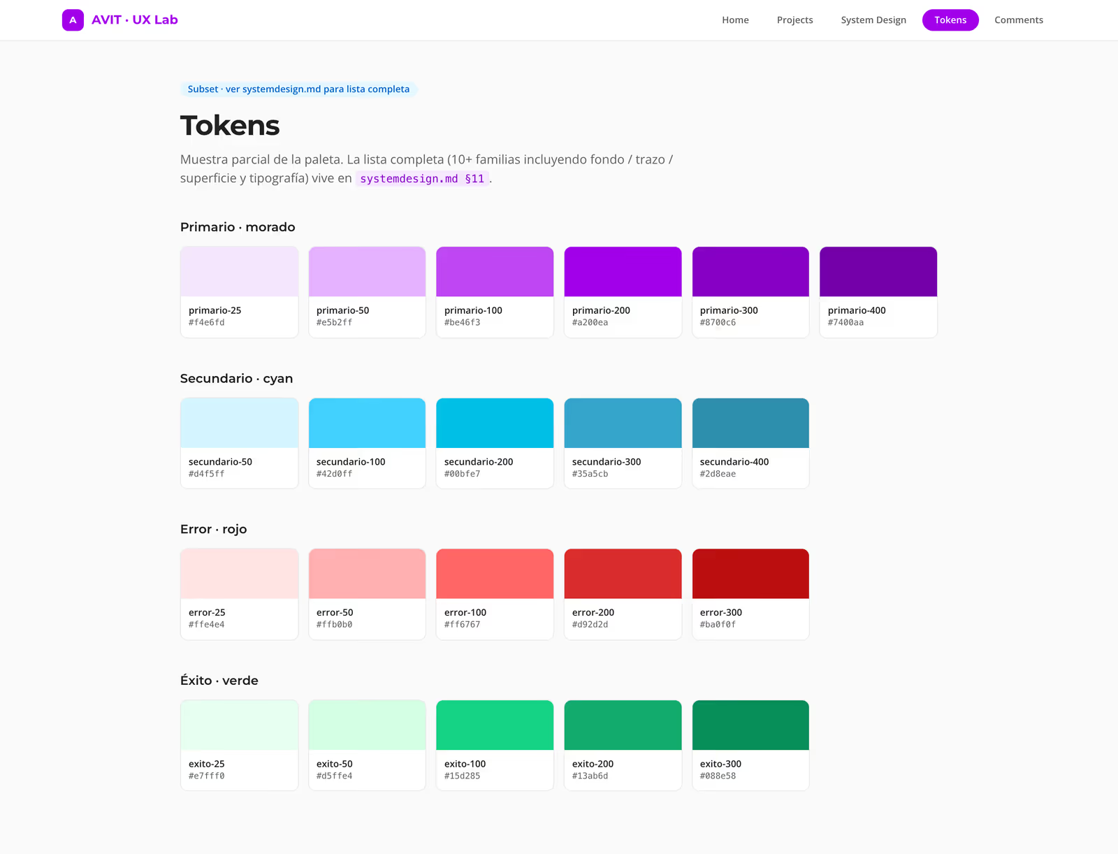
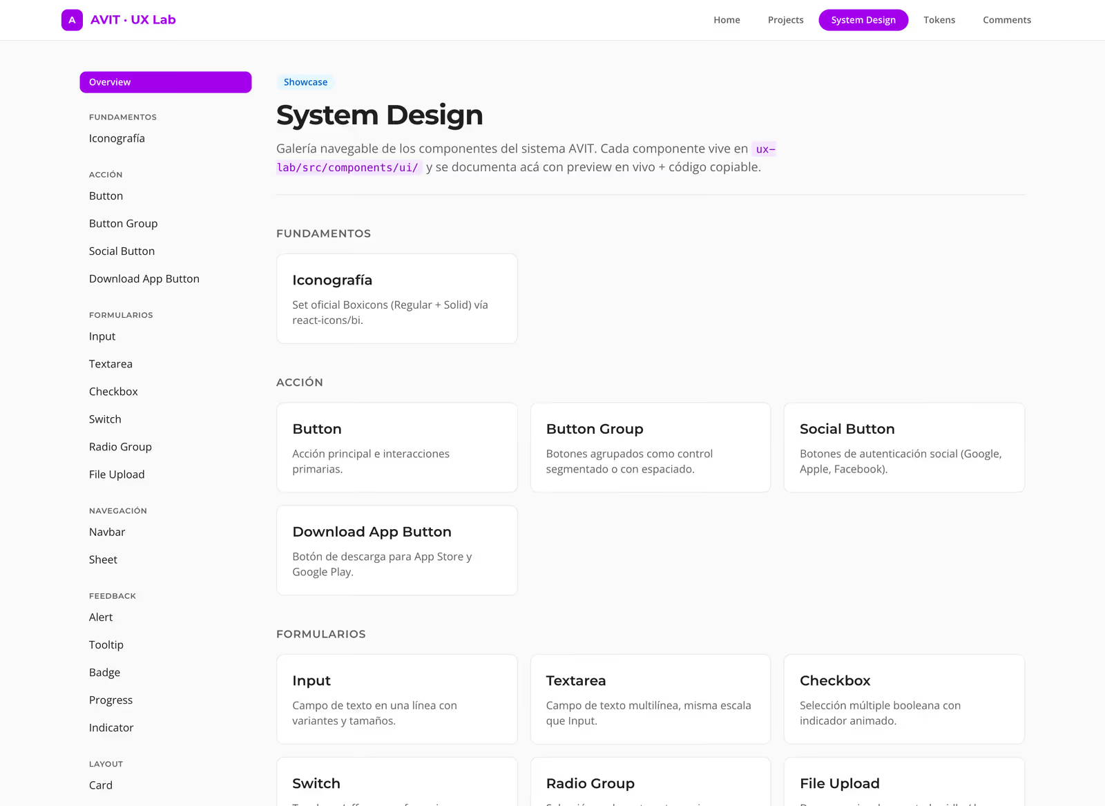
The system stopped being a file you consult and became code that runs: the same tokens feed the documentation, the lab, and — later — the app.
the system, live
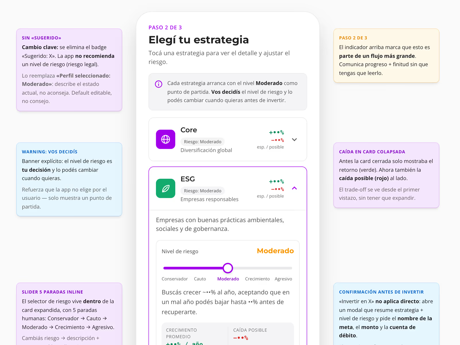
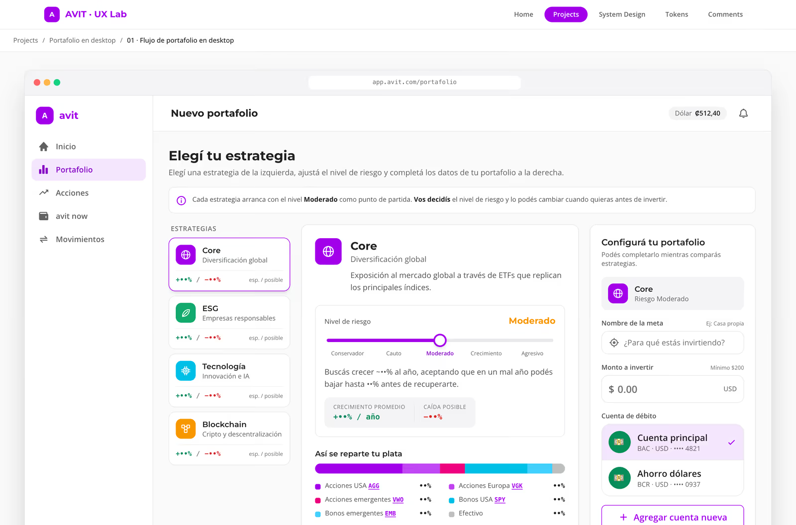
This is the piece that best explains why a prototype you can touch beats a screen you can only look at. Move the risk level and everything else answers: the allocation, the donut, the description. In a static image this is five screens and an arrow; here it’s one gesture.
Step 2 of 3
Choose your strategy
- Fixed income40 %
- Global equities40 %
- Emerging markets12 %
- Cash8 %
A balanced starting point: half the portfolio is trying to grow, the other half cushions the bad years.
A reconstruction of the interaction pattern using AVIT's real palette and radii. The percentages are invented for this demo.
one problem, several options
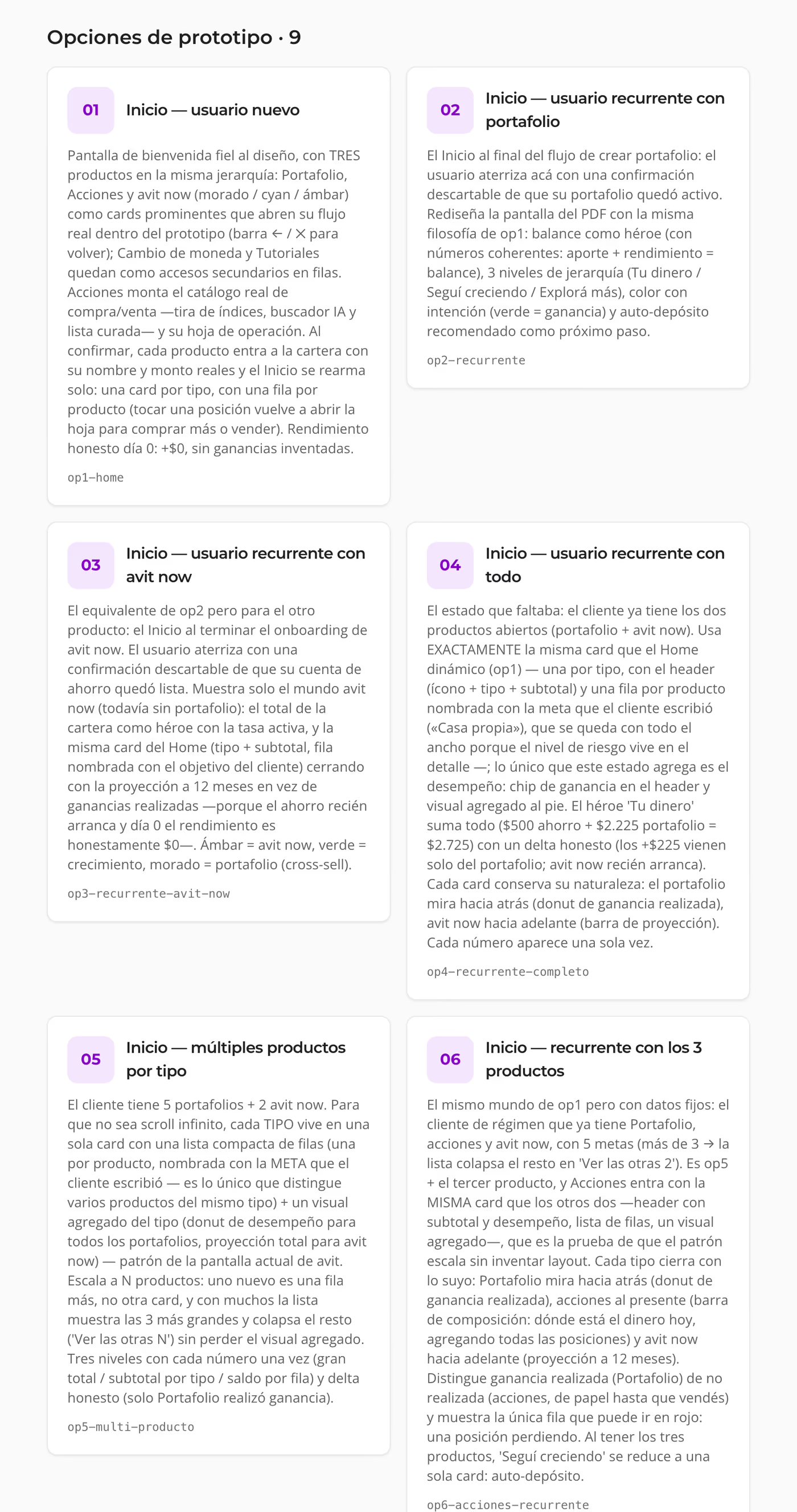
The lab has one rule and everything else follows from it: a problem is never solved with a single proposal. Every UX problem lives as a dated project, with its context and hypothesis written down before anything is drawn, and hanging underneath it every option we actually built, numbered.
Before the first option there’s research. I look at how other investment apps solve the same problem, the regional ones especially: they set which patterns people here already know how to use, and which ones still need explaining. I go back through the UX evaluations of the current flow to see where it snags today. And I find out which parts of the flow are required by regulation, because those don’t move however much they get in the way, and it’s better to know that before proposing something that can’t be built. That’s what I write the hypothesis from. Drawing comes after.
Discarded options don’t get deleted. They’re marked as hidden — they leave the list — but their route stays live, so anyone can walk back in and see why it was dropped. Of twenty prototypes built, most are hidden today. That gap is part of the argument: it was ruled out with the prototype running, not with a picture.
notes in the margin
When you show a client a prototype the same thing always happens: they understand what they’re looking at, but not why it is the way it is. And if you’re not standing there to narrate it, the prototype gets read wrong.
So every prototype carries its own annotation layer. They’re sticky notes living in the margins of the screen, anchored at the height of whatever they explain: the left-hand one tells you the change, the right-hand one the reasoning. Each has a tone depending on what it is — a key change, a warning, something still to be confirmed — and a minimum desired position; if the note above grows, the margin pushes the one below down instead of overlapping it. On narrow screens the margins disappear and the notes stack underneath the phone, in reading order.
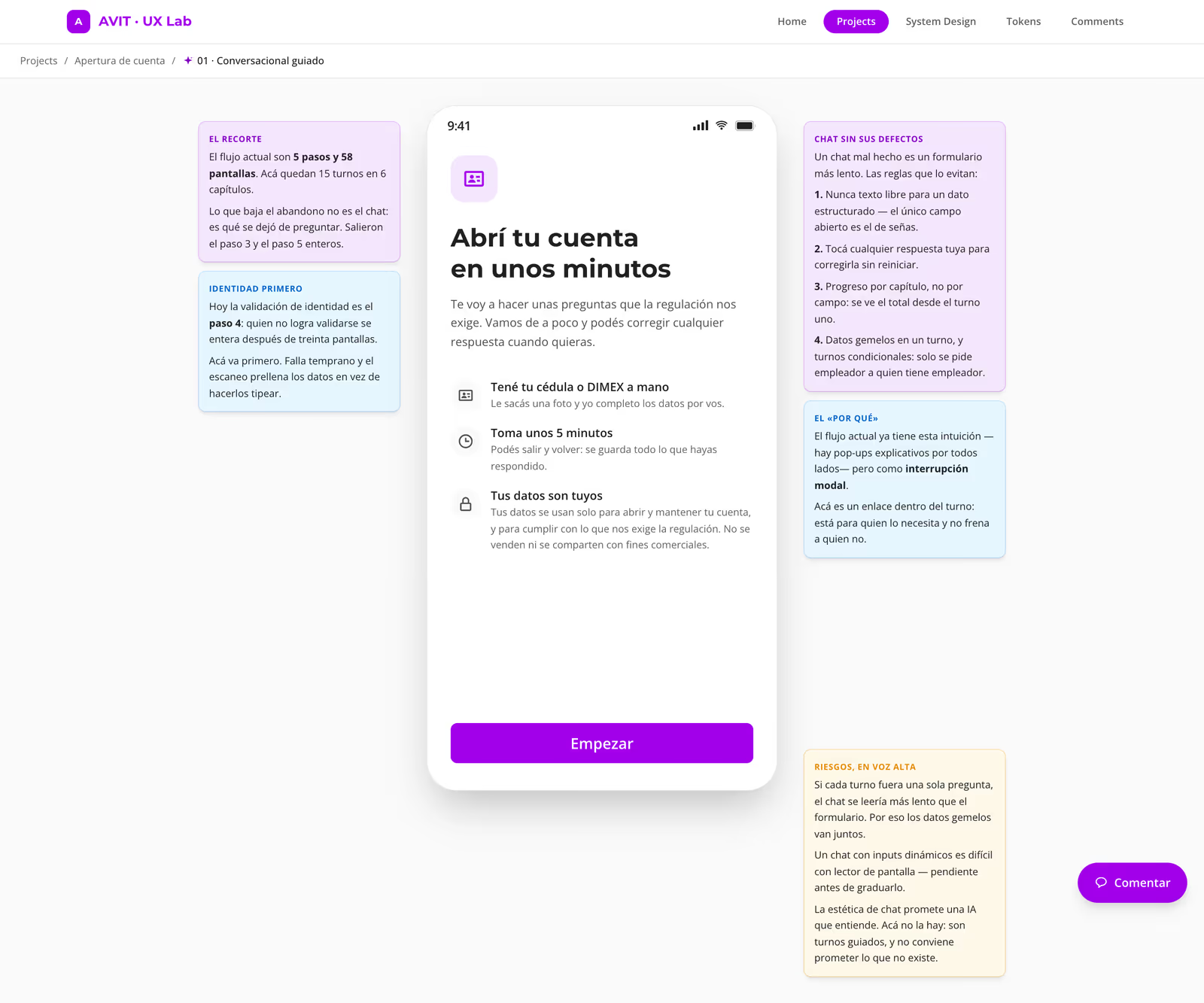
The side effect turned out to be the good part. Because the notes live inside the prototype rather than in a separate document, the meeting stopped being a presentation and became a reading: the client walks through it alone, follows the reasoning, and arrives at the call with questions instead of doubts. Writing the note disciplines me too: if I can’t defend a change in four lines, the change probably isn’t ready.
commenting on the pixel
The client asked for something very specific and very reasonable: to leave feedback without a Figma account and without it getting lost in a chat thread. So I built positional comments into the lab itself.
Every prototype has a floating button. By default the prototype is clean — pins hidden, nothing polluting the design — and the button shows how many threads exist. Turn it on and every pin appears; a click on the screen drops a new one right there. Each pin is a thread: open it, reply, mark it resolved — the pin dims — or drag it somewhere else. Whoever comments only leaves a name; email is optional. No sign-up, no login, no invitation to accept.
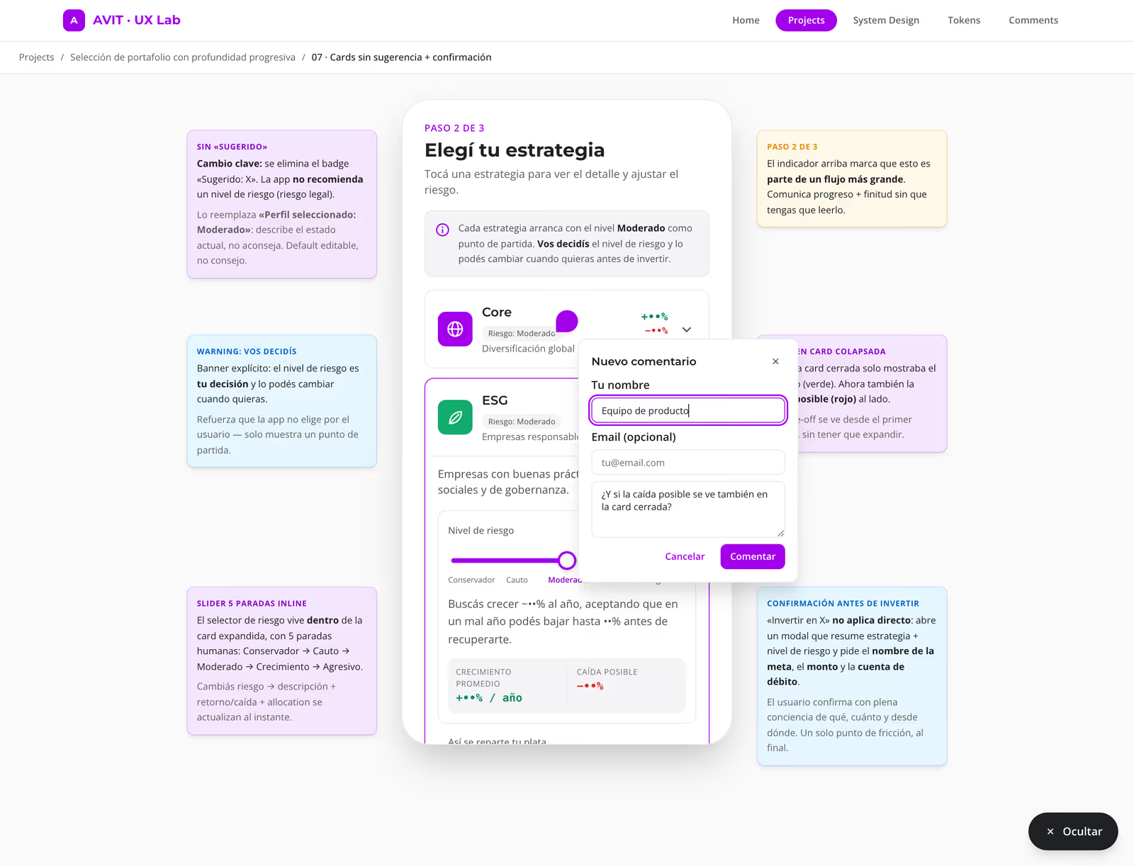
Underneath it’s a single Supabase table with row-level security: open reads, inserts validated by length, and replies modelled in the same table pointing back at the root comment. My favourite design decision in the whole system is also the least visible: pin coordinates aren’t stored in pixels, they’re stored as a percentage of the prototype frame. That’s why the same comment lands on the same relative spot whether you open it on a desktop, where the prototype sits in a 420px frame, or on a phone, where it fills the width. A pin stored in pixels would have peeled off the element it pointed at the moment anyone changed screen size.
I read it all from a separate dashboard, grouped by project and option, with replies nested and a counter for what’s new since my last visit. The published lab also sits behind a password enforced at the edge, before anything is served: without it you don’t even download the JavaScript, and if the configuration is missing the site fails closed rather than exposing the prototypes.
iterating in the open
The loop settled into this: branch, change, automatic preview deploy, link to the client, comment pinned on the screen, merge. Between May and August 2026 that came to 274 commits and around 114 pull requests, with several explorations open in parallel whenever paths needed comparing.
The most honest part of working this way isn’t the hits, it’s the reversals — and they’re all on the record. There was a chapter of the flow the client asked for in the morning and withdrew the same day. There was a discarded option we made visible again weeks later, because the problem had changed shape. There was AI-search copy I had to neutralise so it could never be read as “recommendation” or “advice”. And there was a legal review that rewrote an entire screen: the app stopped suggesting a risk level and started describing the selected one, the possible drawdown moved up onto the collapsed card so the trade-off was visible without expanding anything, and an explicit confirmation was added before investing.
That last change is exactly the prototype you can touch further up this page.
from the lab to the app
In August the lab stopped being the end of the road. The flows that were already settled began graduating into a second application built with Ionic and Angular — the product’s real stack — running Metamap’s identity verification for real and the data Alpaca requires as custodian.
They’re two applications with different purposes and they share no code: the lab compares options, the app runs a single version the way production would. The only thing they share are the tokens, duplicated on purpose. And the rule runs one way only: lab first, app second. Nothing gets ported before it’s settled.
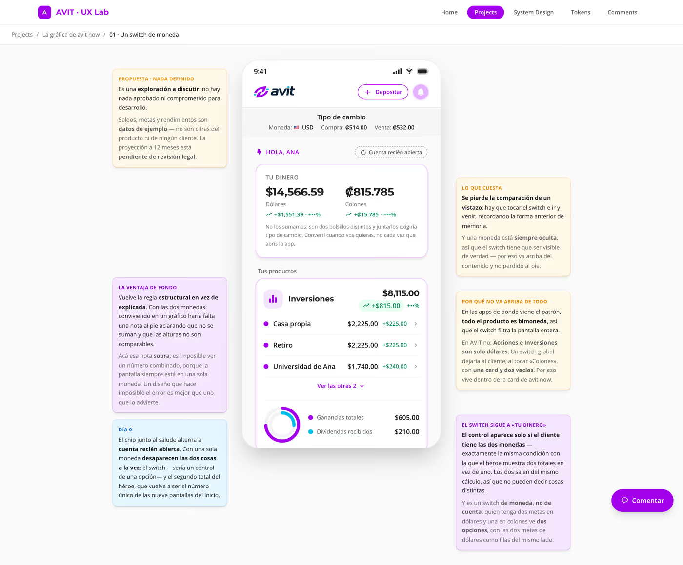
Two examples of what changed along the way. The savings product’s onboarding went from five screens to one, with the only decision that genuinely matters — the currency — right at the top. And account opening, which today is five steps and more than fifty screens counting a single branch, was cut down to fifteen turns across six chapters: identity validation moved to the first chapter so it fails early instead of thirty steps in, and scanning the document fills the fields in rather than making someone type them.
That second one also carries the decision I’m proudest of, and it’s a screen I chose to delete. The “application under review” state lasts hours or days; a closing screen is read once and left behind. What the person still needs has to live where they come back to, which is the home screen.
what I’m taking with me
- Auditing is designing. The hours I spent reading exported tokens — finding typos, grids that lied, shadows from someone else’s palette — were worth more than any new screen. You can’t build on a system nobody trusts.
- Document the defect instead of hiding it. If the docs fix what Figma doesn’t, the docs start lying the day they’re written. I preserved the typos with a note beside them, and the file stayed true.
- A proposal isn’t a decision. Building several options costs more, but it changes the conversation: you stop debating taste and start comparing behaviour. And ruling something out with the prototype running leaves a record a picture never does.
- The argument travels with the screen. Margin notes let the client walk through it alone and understand the why. The meeting stopped being a presentation and became a conversation.
- The invisible detail is the one holding it up. Storing comments as percentages rather than pixels shows up in no screenshot, and it’s the only reason feedback keeps pointing at what it was pointing at.
- I’m still in it. There are chapters left to write, decisions left to reverse and flows left to graduate. I’ll keep updating this case as I’m able to tell it.