The context
Findasense is a global digital transformation consultancy. When I joined the project, their site had a quietly broken hero: the most valuable space on the page was an internal note about being acquired by TP Infinity. The brand was talking about itself before the user even understood what it did.
On top of that, “design debt”: duplicated sections, broken hierarchy, long forms. The site informed, but it didn’t convince.
My challenge was to flip this under a simple premise: the user doesn’t want to know who you are until they understand how you can help them. I didn’t start with design — I started by understanding why the site wasn’t working.
Audit and references
The audit revealed that 60% of the issues weren’t pixel problems — they were structural. Four patterns kept coming up:
- Sections saying the same thing twice. “What we do” and “What problems we solve” lived apart but told the same story.
- No visual hierarchy. Everything competed for attention at the same level — H1, paragraphs, and links read the same.
- Dead-end navigation. From “Insights” there was no way back to Home. The flow just stopped.
- Long forms. Every extra field was an abandonment point.
Then I looked at what the reference agencies were doing right — R/GA, MRM, GUT, Globant, Huge — and took three ideas:
- Bold + uppercase in hero to sound authoritative without losing warmth.
- Modular layouts that scale without rewriting CSS every time a new block comes in.
- Red hovers as the single accent, not decoration: the hand guiding to the click.
Three pillars, three decisions
With the audit on the table, I narrowed the redesign down to three pillars. Each one with a concrete decision behind it:
- Clarity. The Hero went from “corporate news” to direct value proposition. If you don’t understand what Findasense does in five seconds, I failed.
- Trust. I moved Success Stories and client logos (Coca-Cola, Lenovo, Bimbo) up to the first scroll. What used to live below the fold became the first thing users see.
- Conversion. The long form was broken into five single-field steps. Less friction per screen, same data collected.
Reorganizing the house
I rewrote the sitemap by flipping the traditional order: what we do first, who we are after. Conversion and expertise come first; the company history, behind.
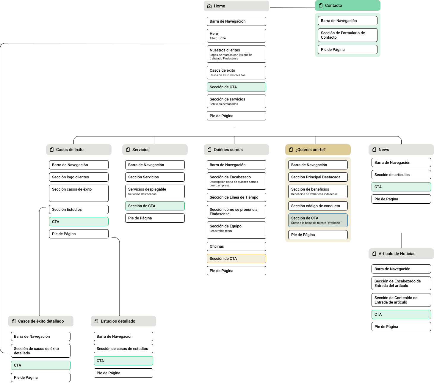
Two decisions came with this restructuring:
- UX Writing. Methodology and culture sections were unified under “Who we are.” Fewer doors, same content.
- Persistent navigation. The Header always carries a contact CTA and an ES/EN/PT selector visible from any level. No one gets lost.
From wireframe to system
I designed in Figma with a UI Kit built for WordPress 6.4 from day one. The rule: nothing the dev team couldn’t replicate with Gutenberg.
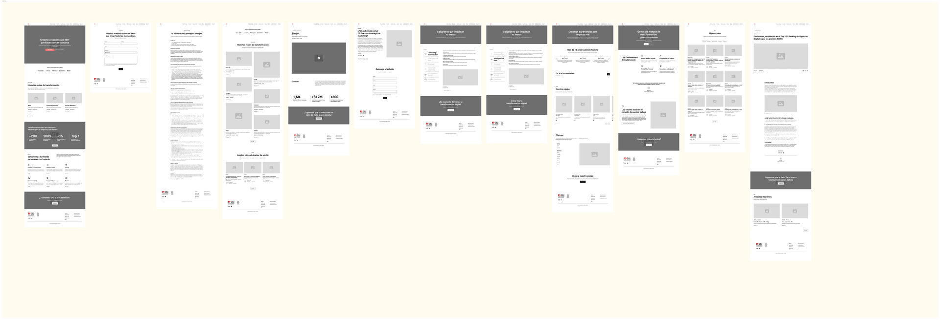
Low-fi wireframing. I mapped the flow making sure no page was a dead end — especially news and press, where users used to get stuck.
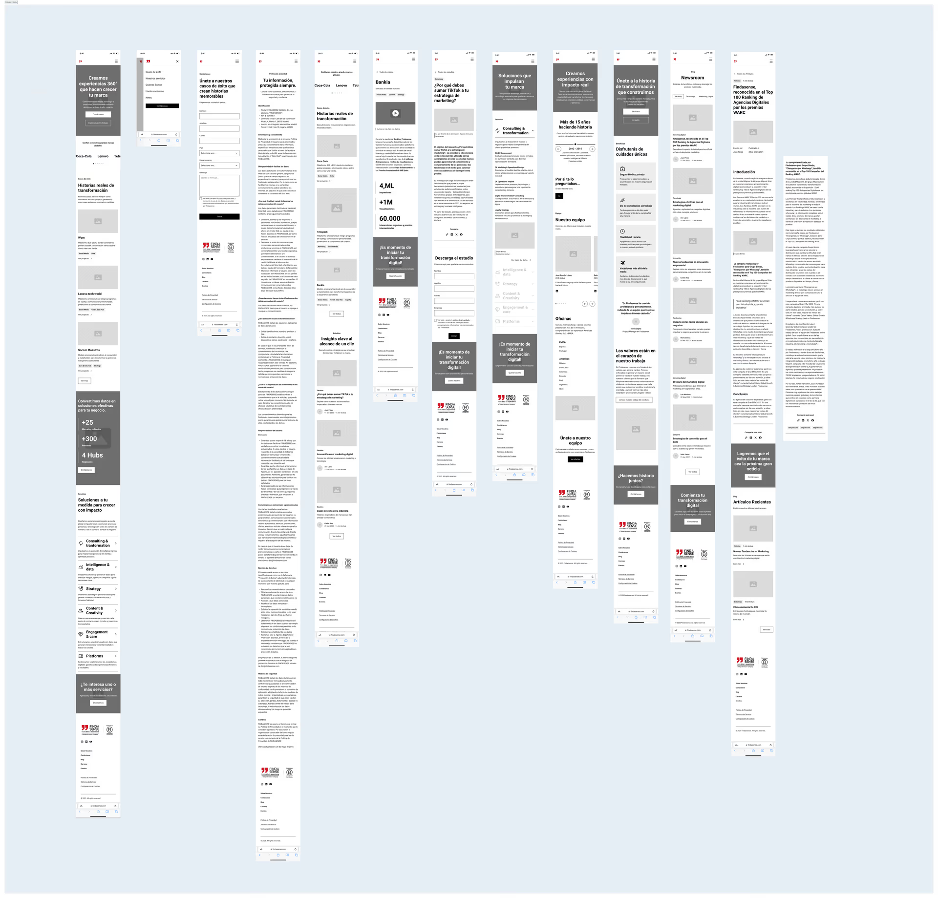
High-fidelity. Four decisions that shaped the system:
- Color blocks to visually separate services and success stories without needing to read.
- Findasense Red as the single accent — keywords, hovers, buttons. Nothing else.
- Mobile first for real: every component tested on mobile before desktop.
- Navigable prototype delivered to the internal team to test transitions and the form flow before handoff.
Design System (UI Kit)
The visual system was built as a solid, scalable foundation: color tokens, typographic hierarchy, and consistent components that ensure coherence across the digital ecosystem and ease of maintenance in WordPress.
Color
A palette built around Findasense’s signature red as the single accent, balanced with black, cream, a sky blue for tech blocks, and white as the clean base.
Orange
#F04130
brand-red
CTAs, hovers, brand accent.
Black
#121212
brand-black
Headings and main copy.
Cream
#EFE2CF
brand-cream
Warm blocks, services.
Sky Blue
#54A4DB
brand-blue
Tech and data blocks.
White
#FFFFFF
brand-white
Clean base, spacing and cards.
Typography
A single typeface — Montserrat — used across all weights to keep a coherent visual voice between headings, body, and UI. Uppercase in hero and key sections to reinforce editorial tone and brand authority.
Aa
Montserrat Bold
font-bold · 700
Use: H1 to H6, taglines, CTAs. Uppercase in hero and impact sections.
Aa
Montserrat Regular
font-normal · 400
Use: paragraphs, nav, forms, captions. Light, Medium, and Semibold for secondary hierarchy.
Brand asset: the comma
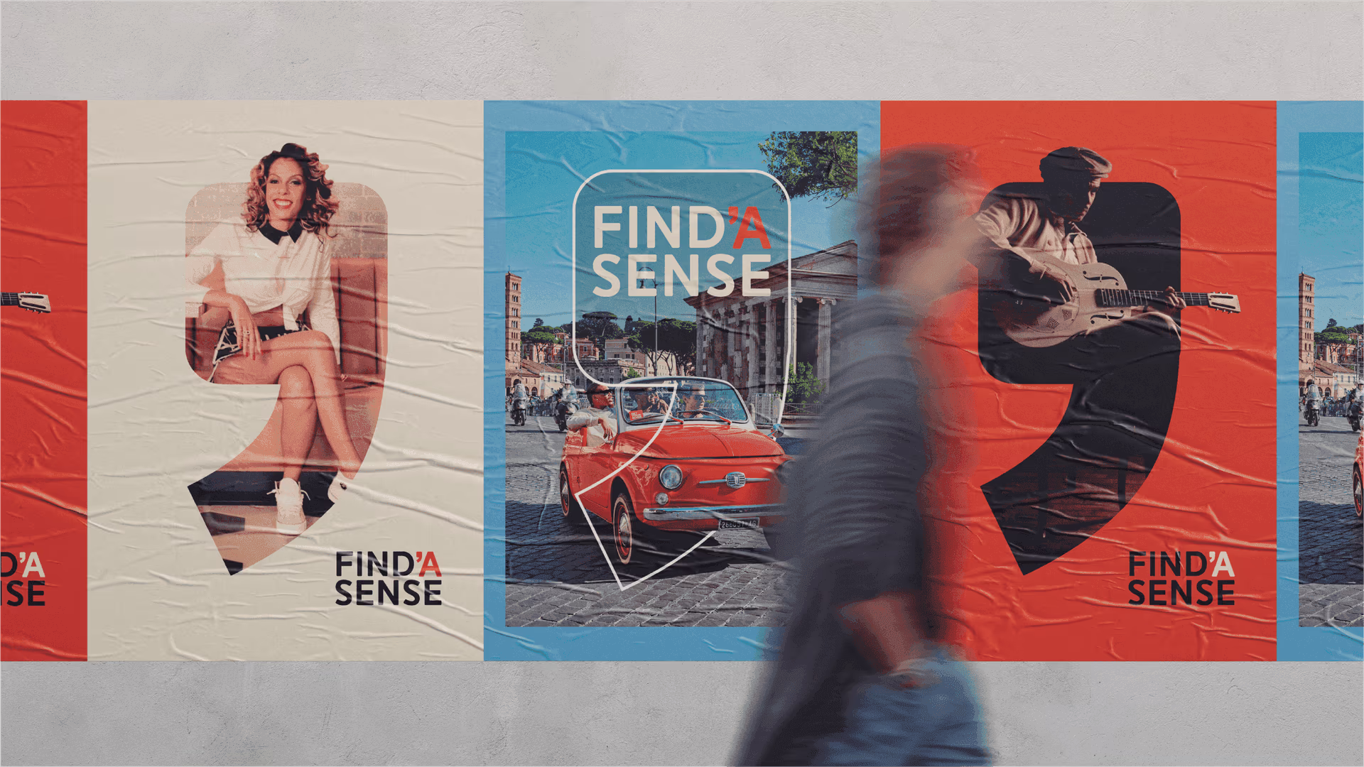
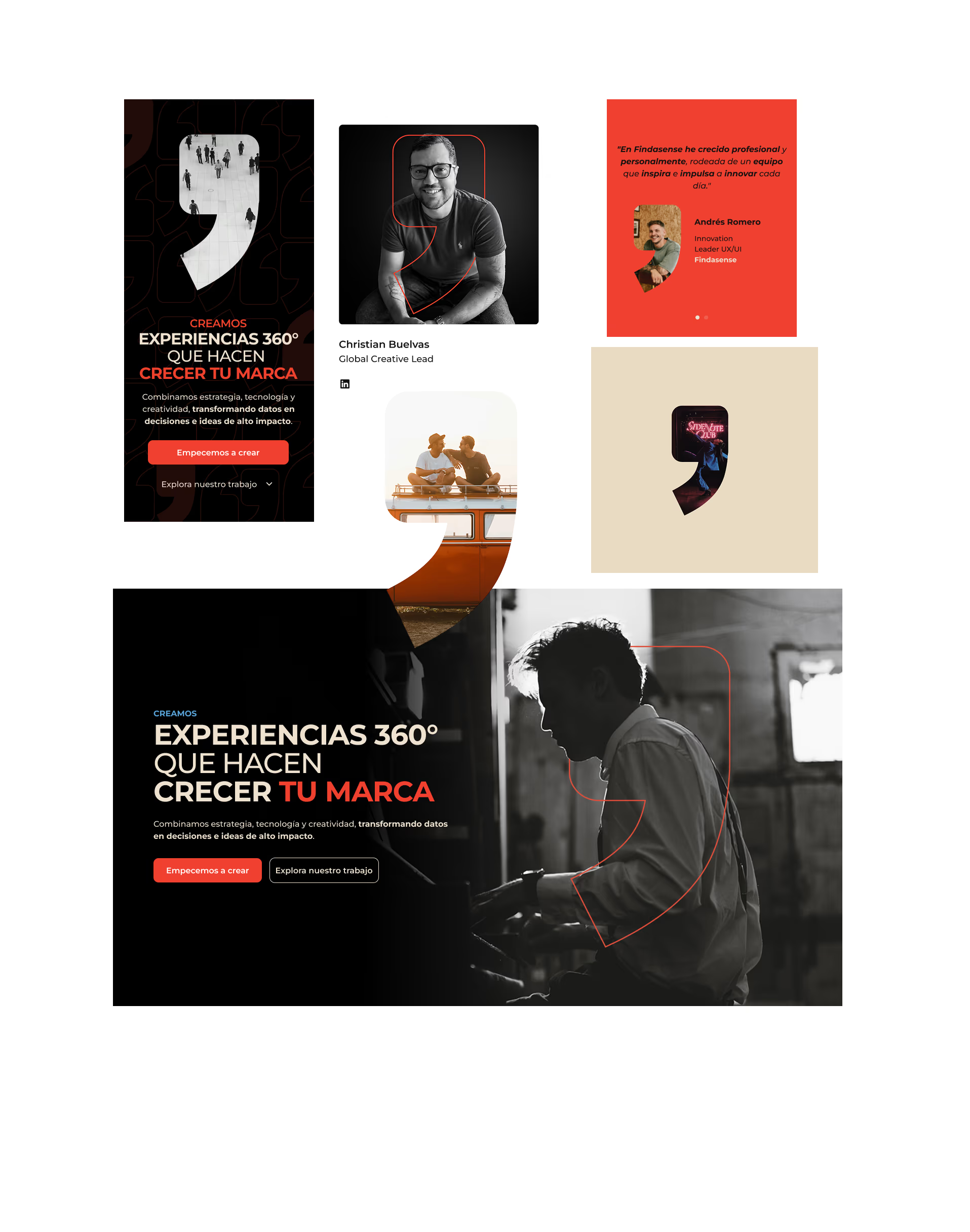
The comma from the logo stopped being a typographic detail and became the visual device that ties the whole system together. I used it as a portrait container, a frame for hero illustrations, a background for testimonials, and a decorative element. One shape, many roles — same form, different weights.
Final prototype
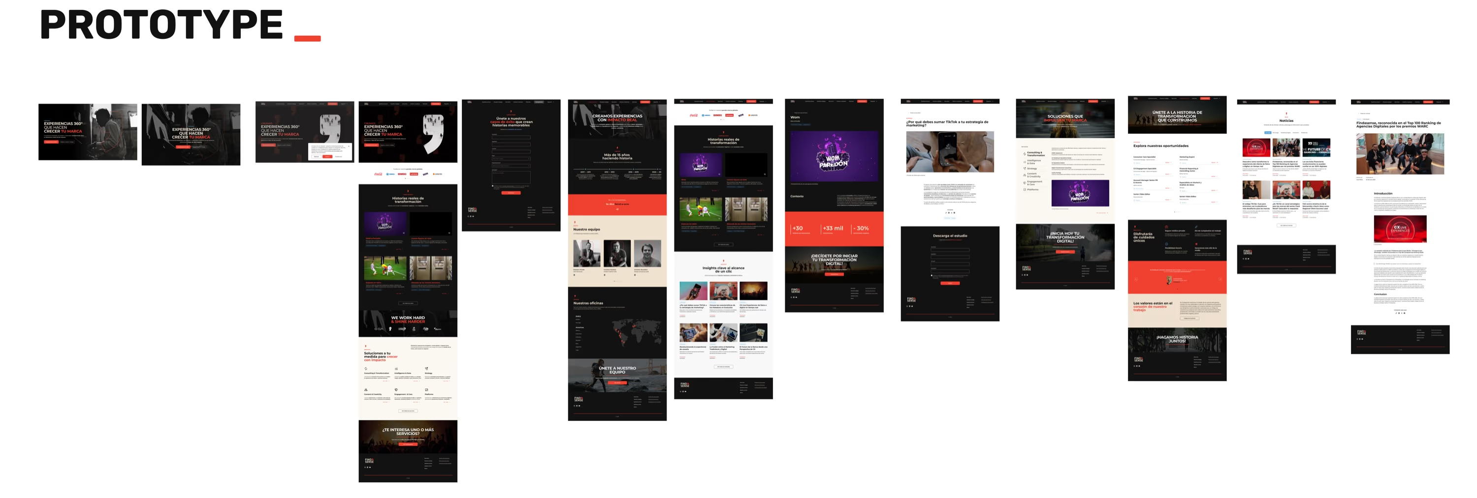
The result: a website that says what it does before saying who it is. Direct hero, success stories on the first scroll, frictionless form, and a coherent visual identity from start to finish.
Full scroll · Desktop
Designing for what gets built
Since the site would be implemented in WordPress 6.4, every block went through a check with the dev team: if it couldn’t be built with Gutenberg or a visual builder, it didn’t make it into the design. That protected loading speed (WPO) and removed custom code that would’ve been a pain to maintain.
The weekly reviews with the team sharpened three things:
- The Hero message — version after version until anyone could get it at a glance.
- The tactile response of mobile buttons — bigger tap areas, clearer feedback.
- Multilingual consistency — some layouts broke in Portuguese due to text length, I adjusted them.
Solution and impact
The result is a minimalist, powerful, and results-oriented website that redefines Findasense’s digital presence.
Positioning
Findasense now visually competes with the best agencies in the world, conveying authority and modernity.
Usability
Navigation errors were eliminated, and click depth to reach key information was reduced.
Conversion
The new simplified form is designed to significantly increase the volume of qualified leads.
Scalability
A robust component system ready to grow and adapt to the consultancy's future needs.
Deliverables
- UX Audit and competitive Benchmark.
- New Sitemap and Information Architecture.
- Low and High Fidelity Wireframes.
- Full UI Kit: Variables, components, and styles.
- Interactive prototype in Figma.
- Style guide for WordPress implementation.
Live digital ecosystem
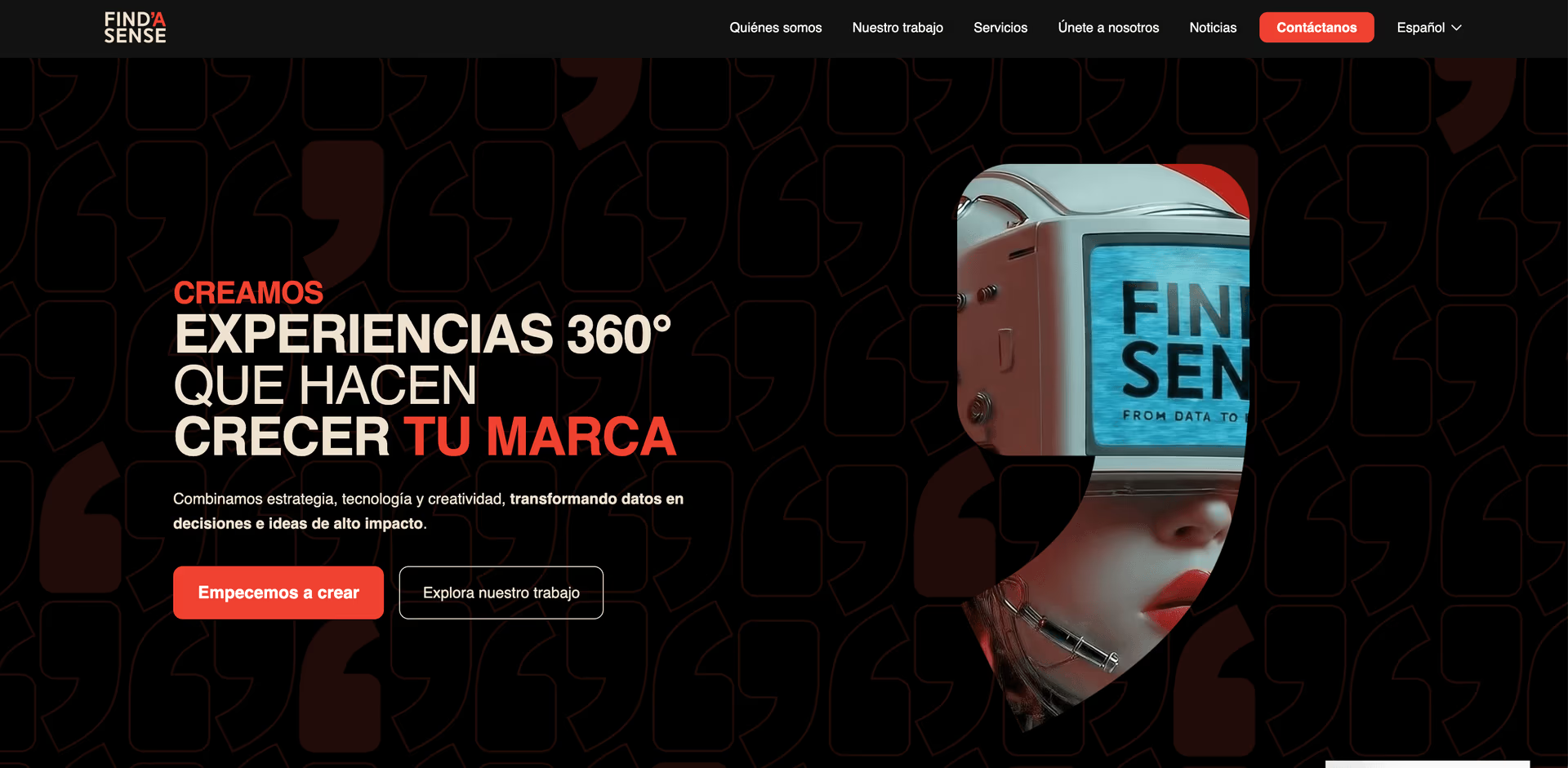
Explore the experience designed for Findasense’s global ecosystem.
Click on the image to explore the real website ↑